
Landing pages built for the click you paid for.

Doubling the page's conversion rate halves what a customer costs. It is usually cheaper than finding better traffic.

A hand-drawn page layout sketched in a notebook on a wooden desk

What we measure

  • Clicks (not what we judge you on)
  • Visitors (not what we judge you on)
  • Cost per customer

−34%cost per booking · clinic client

The advertising is working. People arrive, look at a page built for browsing rather than deciding, and leave without telling you why.

  • The advertisingWorking
  • People arrivingFine
  • Why do they leave?Unknown

One client, four months

More new-client bookings, including the ones made after closing time.

A group of three clinics whose Google Ads sent people to a contact form and a callback, and whose campaigns were judged on form fills. We rebuilt the site around online booking, then measured booked treatments instead of enquiries.

new-client bookings from Googlenew-client bookings
+58%
cost per booked appointmentcost per booking
−34%
of online bookings made after closing timebooked after closing
41%
Read the full case study
Patients receiving light therapy treatments in a clinic setting

What counted as a result

BeforeA contact form sent

AfterA treatment booked

What changes

Three things worth more than a redesign.

Each is usually cheaper than finding better traffic.

  • You get

    One promise per page

    The advert made a promise. The page keeps the same one, in the same words, at the very top. Most of the loss on paid traffic happens in that first inch.

  • You get

    A cheaper first action

    Asking a stranger for a meeting is expensive. Asking a question they can answer in one tap is not, and it tells us what the traffic is worth even when nobody buys.

  • You get

    A reason for every change

    Tests run one variable at a time with the result written down, so the page accumulates knowledge instead of opinions.

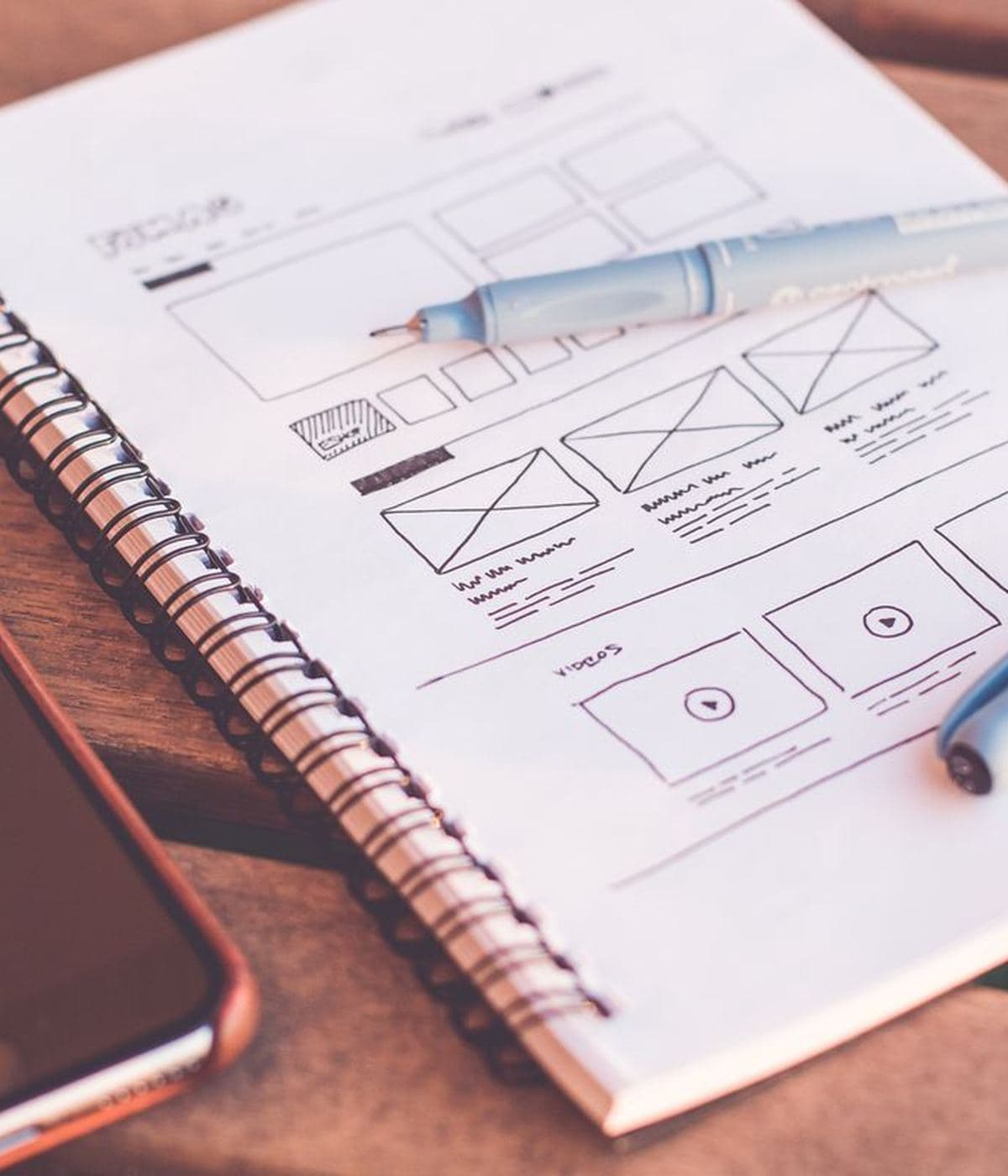
A notebook of hand-drawn page wireframes beside a phone on a desk
Before anything is builtMost of the argument happens here, on paper, before anything is built. A layout settled in a notebook costs an hour to change and a fortnight once it is code.

How it runs

Your cheapest gains come first.

The order is deliberately unglamorous. Most of the available gain is in the first two steps, and a redesign that skips them just makes the same mistakes prettier.

Fix what is wrong

  1. Watch what actually happens

    Where people stop, on which device, and what the form does to them. A week of honest recording beats a month of argument.

  2. Fix the match

    Advert to headline, headline to action. When those three disagree the page leaks before anybody has read a word of the argument.

  3. Ask for less

    Fewer fields, a smaller first step, and a reason to act that is true. Every field you remove is a percentage you keep.

Then test

  1. Then test what persuades

    Proof, order, offer. One at a time, long enough to be sure, with the losers recorded so the same idea is not retried next year.

What is included

A page for every campaign, and a record of every test.

  • A landing page per campaign, built fast and owned by you
  • Copy written against the advert, not adapted from the home page
  • Forms in steps, so an abandoned one still tells us something
  • Page speed treated as a conversion problem, because on phones it is the biggest one
  • Measurement built in from the first version rather than added afterwards
  • A written record of every test: what changed, what happened, what we concluded

FAQ

The questions we hear most.

Usually. If it is a common platform we work in it directly. If it is slow or locked down enough to block the work, a separate page for paid traffic is often faster and cheaper than fighting it.

Your turn

Bring the page your ads send people to.

Tell us where it lives and what it is meant to do. Within a working day we will tell you what we would look at first, roughly what it would take, and whether we are the right people for it.